Apothic Dark labeling
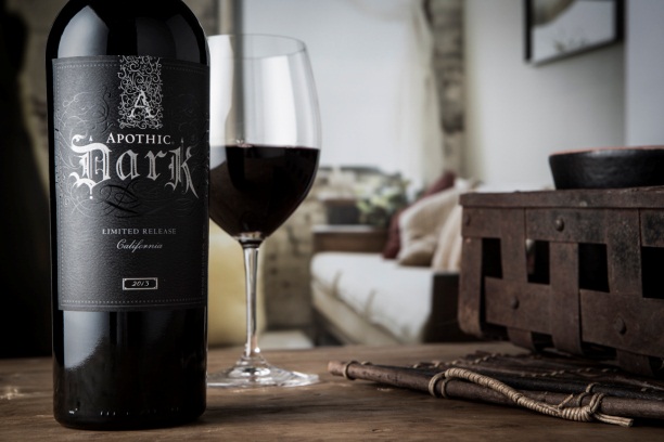
My object to analyze is a bottle of red wine with a rich flavor of dark fruits such as blueberry and blackberry with touches of coffee and dark chocolate to compliment it.
As we can see the labeling of the product has a design that is strongly influenced by the Victorian era where ”extravagant embellishment was applied and appeared as elaborate borders and lettering in graphic design” (Visual art department, WordPress). Also, have some touches from Art Nouveau on the background where we can see the swash and natural forms inspired by plants and flowers.


Figure 2, 3 & 4
The most relevant aspects that lead us to the Victorian period are the ”A” logo that we can found it on the cap of the bottle and on the top side of the label where the ‘A’ letter is surrounded by an excess of ornaments with natural curved forms. The different sizes and weight of the type in the layout are also representatives of this era. Also, the Black-letter font used to reinforce the type of wine is effective because it gives us the impression of old and as we know for wine older is better taste and quality.
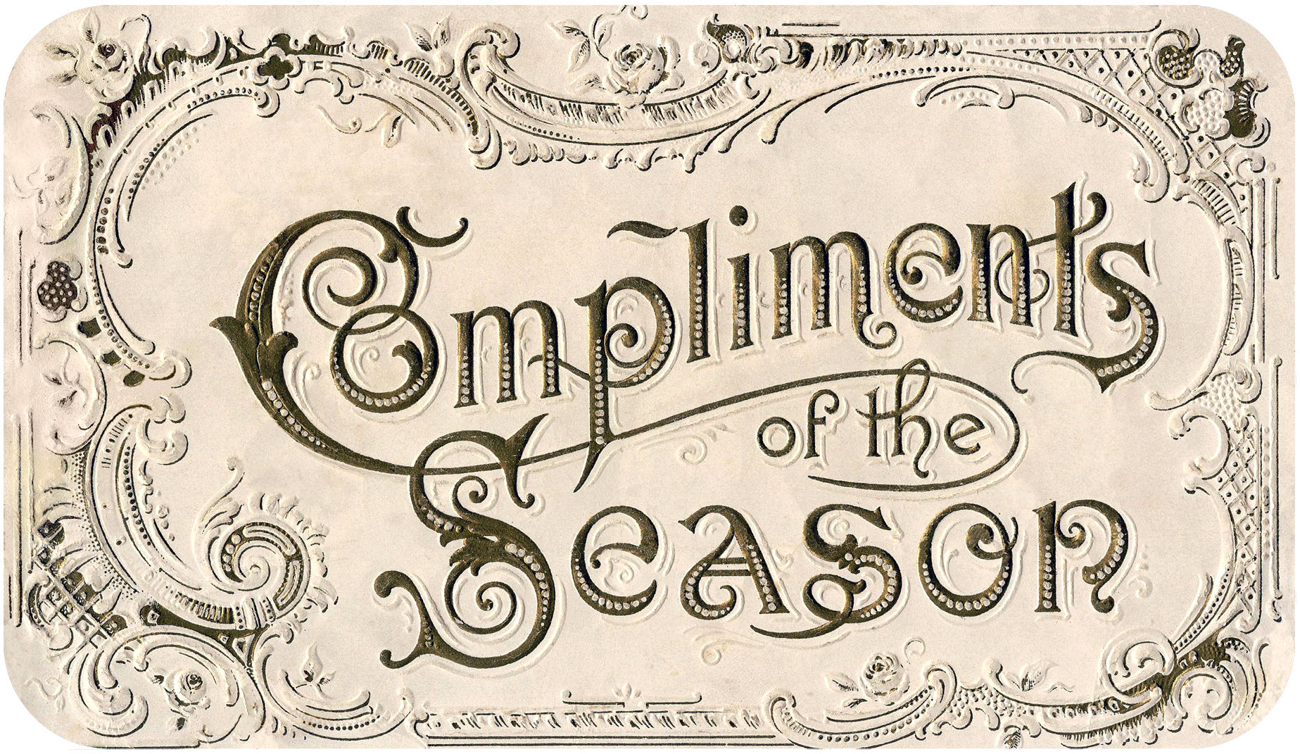

Compassing figure 6 with the design of figure 5 the similitude we can see is the use of swash lines with natural forms, the use of design banners is also very specific from this era. Also, the bold text and the shapes of the serifs have a lot of similarities.
Bibliography:
- -Graphic Design History. (2019). The Victorian Era. [online] Available at: https://visualartsdepartment.wordpress.com/the-victorian-era/ [Accessed 10 Jul. 2019]
- -En.wikipedia.org. (2019). Victorian decorative arts. [online] Available at: https://en.wikipedia.org/wiki/Victorian_decorative_arts [Accessed 10 Jul. 2019].
- -SitePoint. (2019). The Blackletter Typeface: A Long And Colored History — SitePoint. [online] Available at: https://www.sitepoint.com/the-blackletter-typeface-a-long-and-colored-history/ [Accessed 10 Jul. 2019].
Image sources:
- Figure 1 : Digitalhub.fbwineapps.com. (2019). Apothic Dark Beauty Shot | E & J Gallo Digital Asset Hub. [online] Available at: http://digitalhub.fbwineapps.com/Asset/INV19 [Accessed 10 Jul. 2019].
- Figure 2 : Chad J Weed Photography. (2019). Apothic Dark Wine | Arizona Commercial Photographer. [online] Available at: https://www.chadjweed.com/blog/2016/1/22/apothic-dark-wine-arizona-commercial-photographer [Accessed 10 Jul. 2019].
- Figure 3 : own camera
- Figure 4: leaves, G. and 03, G. (2019). Grape leaves 03 stock illustration. Illustration of tendril – 1103349. [online] Dreamstime.com. Available at: https://www.dreamstime.com/royalty-free-stock-images-grape-leaves-03-image1103349 [Accessed 10 Jul. 2019].
- Figure 5 : Watson, K. (2019). Amazing Vintage Christmas Label. [online] The Graphics Fairy. Available at: https://thegraphicsfairy.com/amazing-vintage-christmas-label/ [Accessed 10 Jul. 2019].
- Figure 6 : Pinterest. (2019). Image result for victorian style labels | Labels and business cards | Vintage typography, Vintage labels, Label design. [online] Available at: https://ro.pinterest.com/pin/439804719856325063/?lp=true [Accessed 10 Jul. 2019].
